
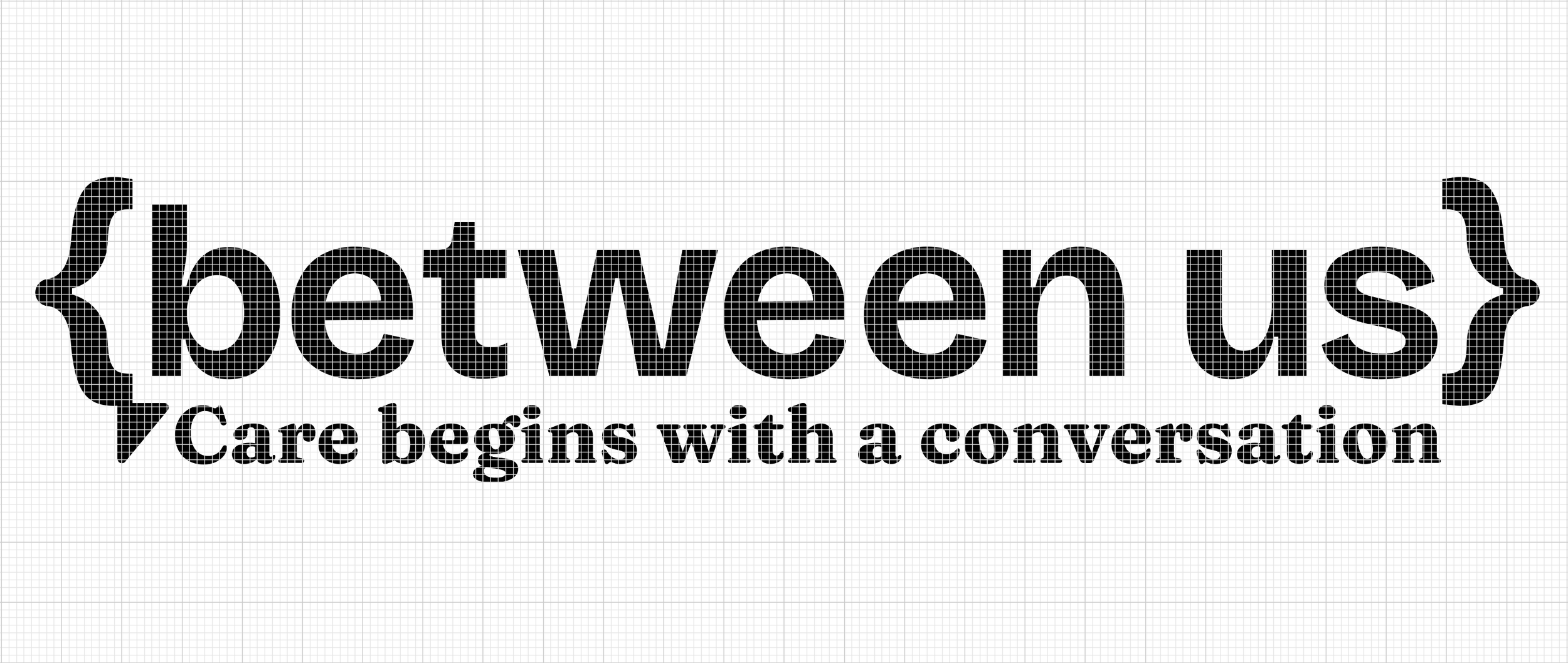
BETWEEN US
Shaping conversations around aging, care and family
Brand identity and system for a narrative-led platform supporting intergenerational care, creating space for discussion around health, aging, family and emotional support.
OBJECTIVE:
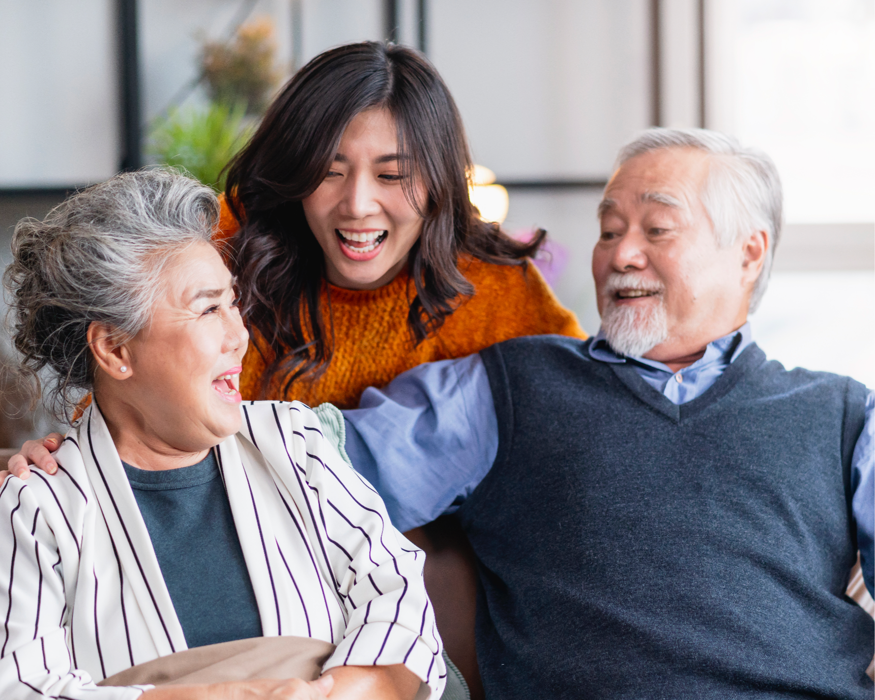
As millennials begin taking on caregiving roles, they are often placed in the position of informal healthcare co-ordinators without the emotional language, cultural frameworks or structured tools needed to manage difficult conversations around health, decline, diagnosis and decision-making.
How can we support millennials in navigating difficult conversations and care decisions with aging parents through tools that provide emotional clarity, structure and guidance?
SCOPE:
Brand Strategy
Brand Identity
Service Design
Visual Design
Information Architecture
Social media and Merchandise design

IDEA
To design a self-help platform that helps millennials navigate the emotional, medical and practical realities of caring for aging parents.
Between Us is built on the idea that Care starts with a conversation. Hospitals provide information, apps track health, but families are left to translate emotions. The platform responds to this gap by focusing on communication rather than just clinical care, providing structured language, scripts and guided tools that support clarity, confidence and emotional grounding in family conversations so the burden of care is made more manageable and people feel supported in making decisions together.
EXECUTION:
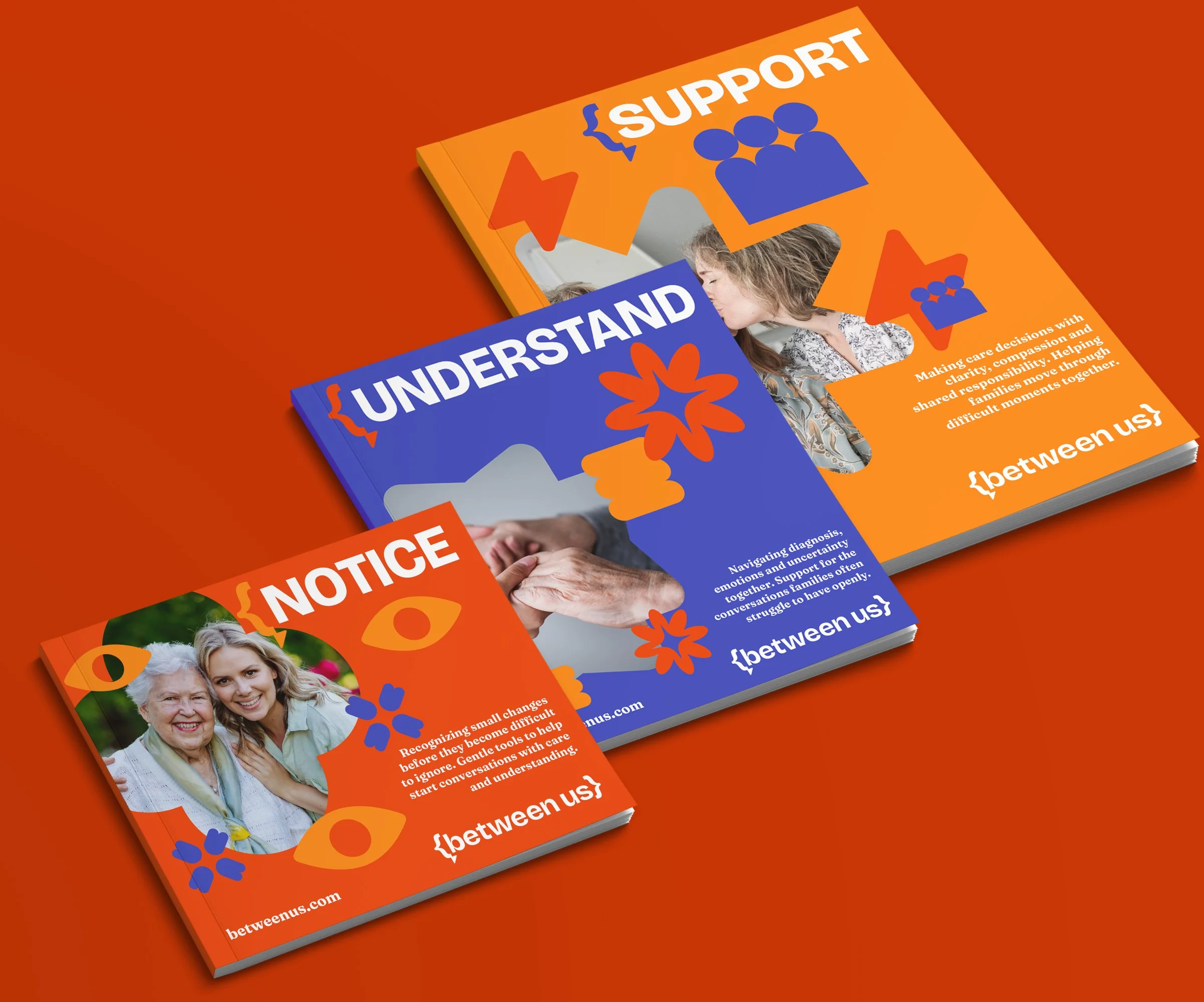
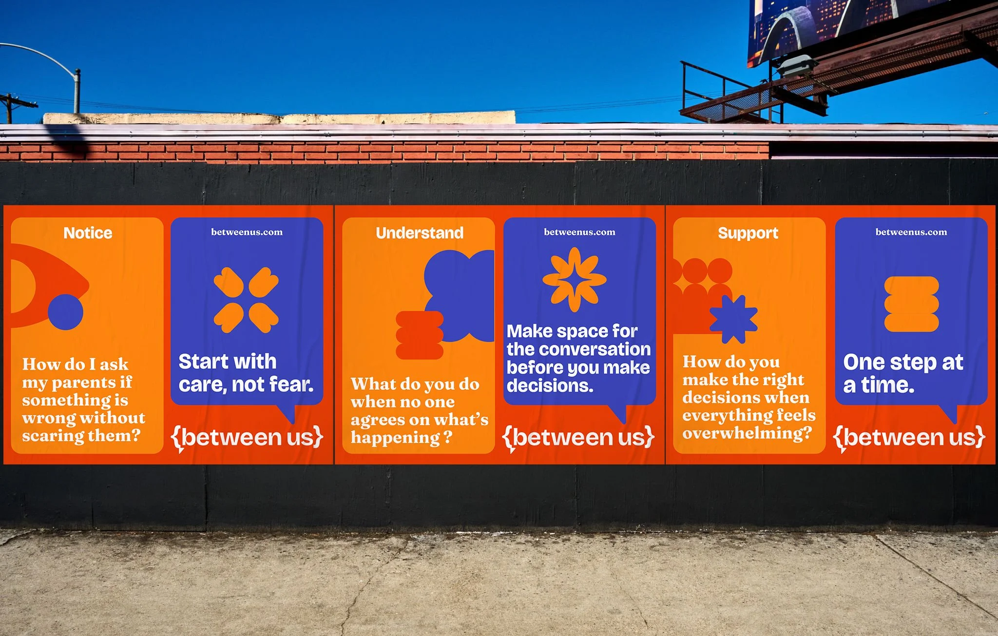
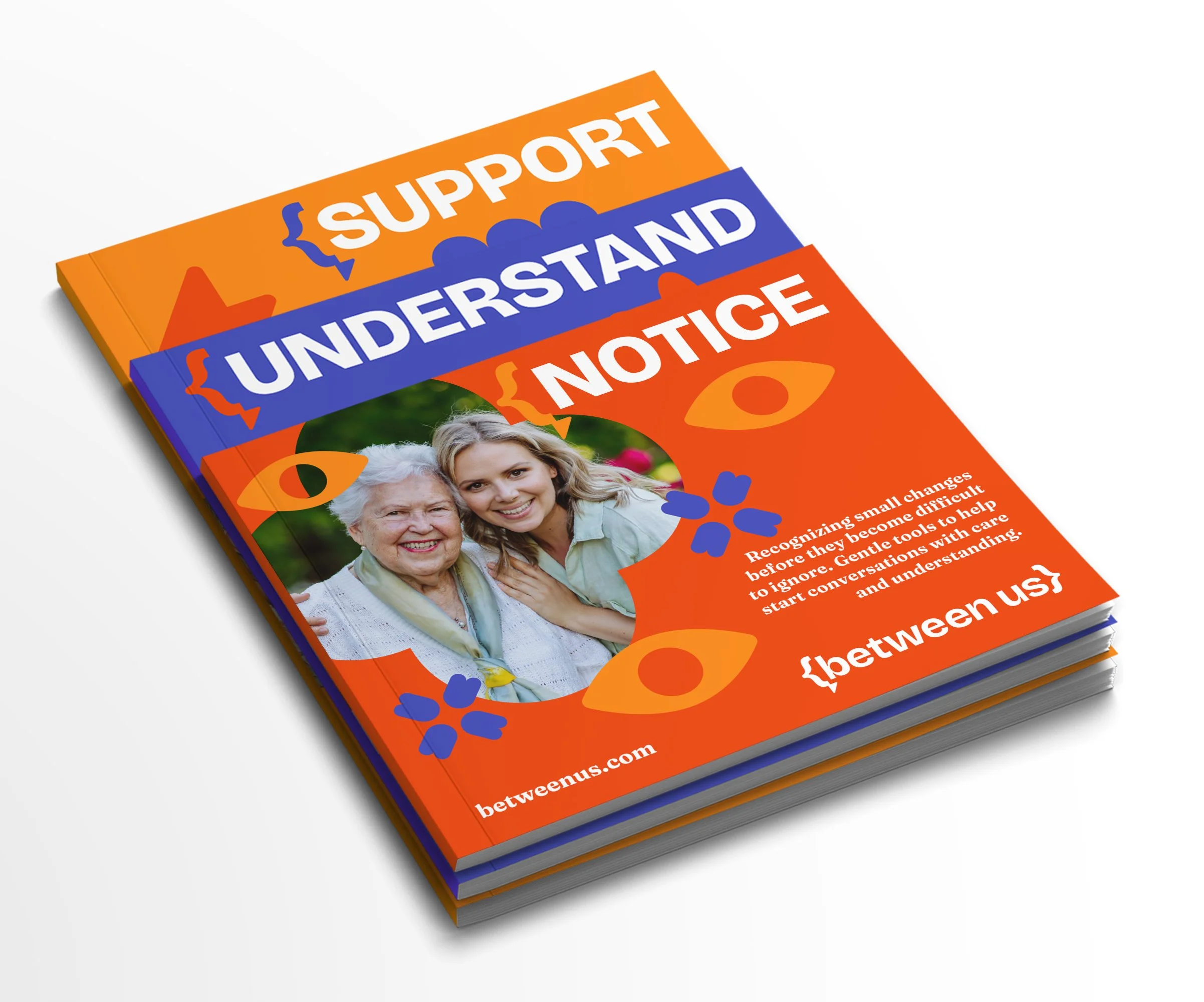
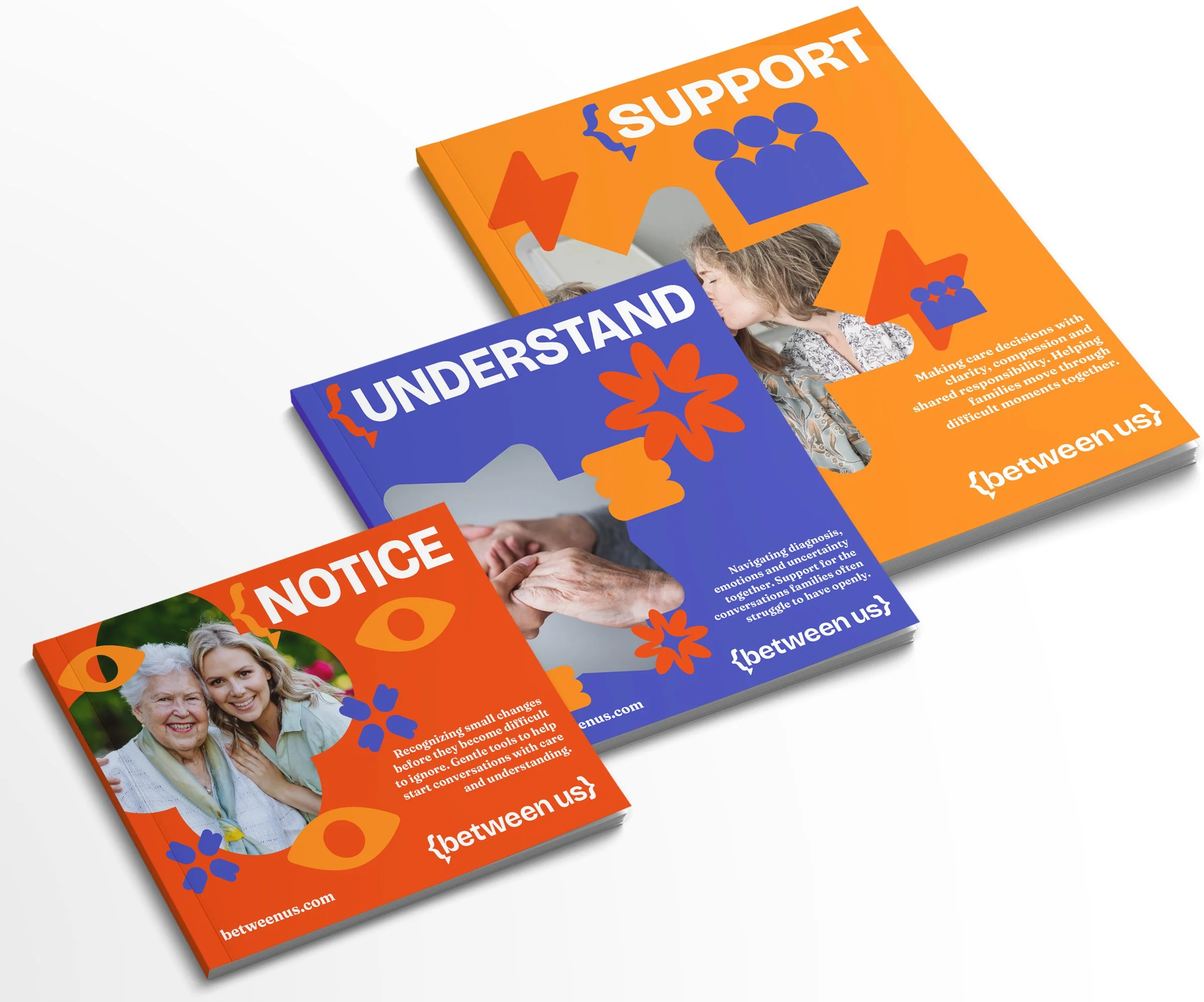
The experience is structured around three emotional stages of caregiving conversations:
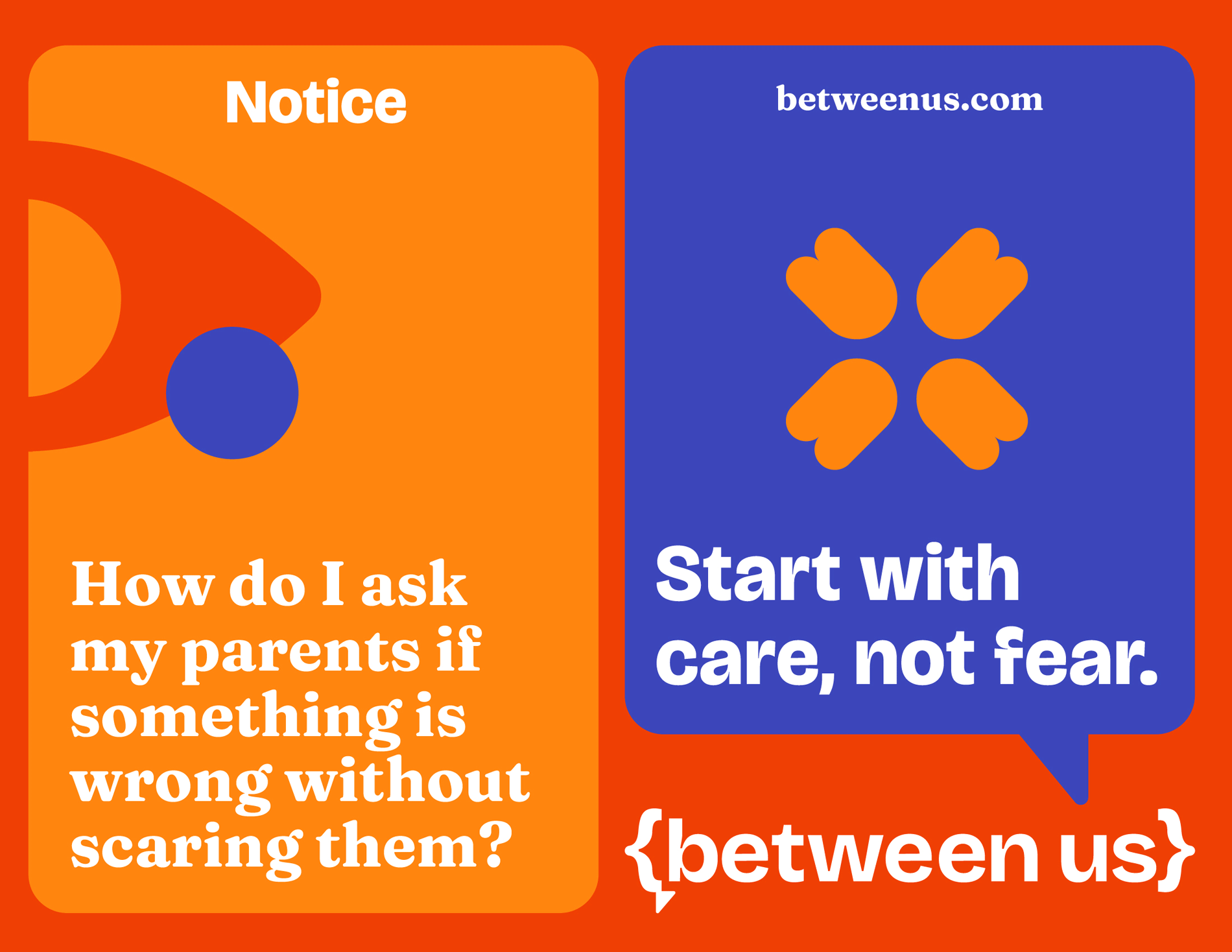
Notice: Early awareness and gentle conversation initiation
Understand: Navigating diagnosis, resistance and emotional tension
Support: Shared decision-making, family alignment and care planning
To support these stages, a range of digital and physical tools were developed including conversation cards, guided worksheets, decision-making templates, care planning resources and doctor discussion guides. These tools are designed to simplify complex conversations and provide users with practical language they can use in real-life situations.
The platform also offers one-on-one virtual sessions with a Care Conversation Expert, providing personalized guidance for millennials navigating difficult conversations. These sessions create a safe space to ask questions, gain clarity and receive support tailored to their unique circumstances.
The platform experience is intentionally non-linear, recognizing that caregiving journeys rarely follow a predictable path. Caregivers can move between stages based on their circumstances, allowing the system to respond to emotional needs rather than fixed timelines.


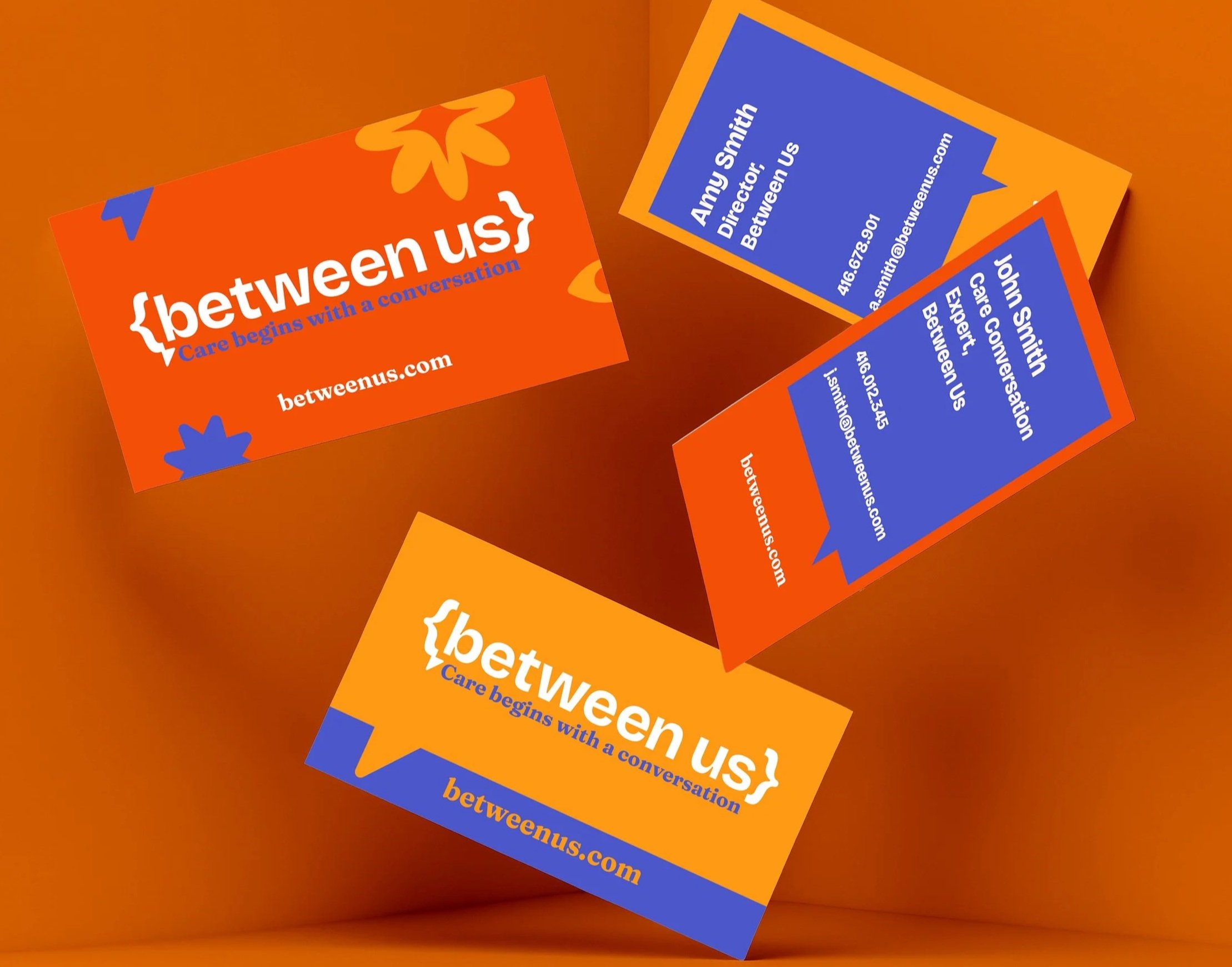
VISUAL IDENTITY:
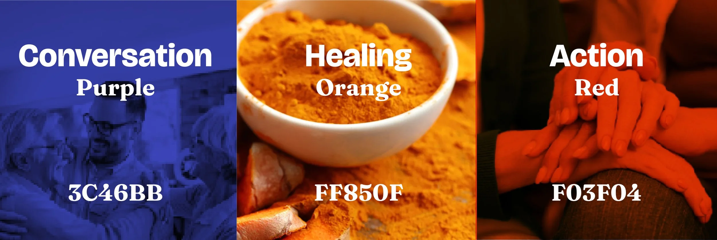
The visual identity is built to feel intimate, conversational and emotionally grounded rather than clinical or institutional. Instead of relying on healthcare conventions, the system uses bold typography, expressive colour and a flexible graphic language to communicate awareness, understanding and action while maintaining a sense of warmth and approachability.
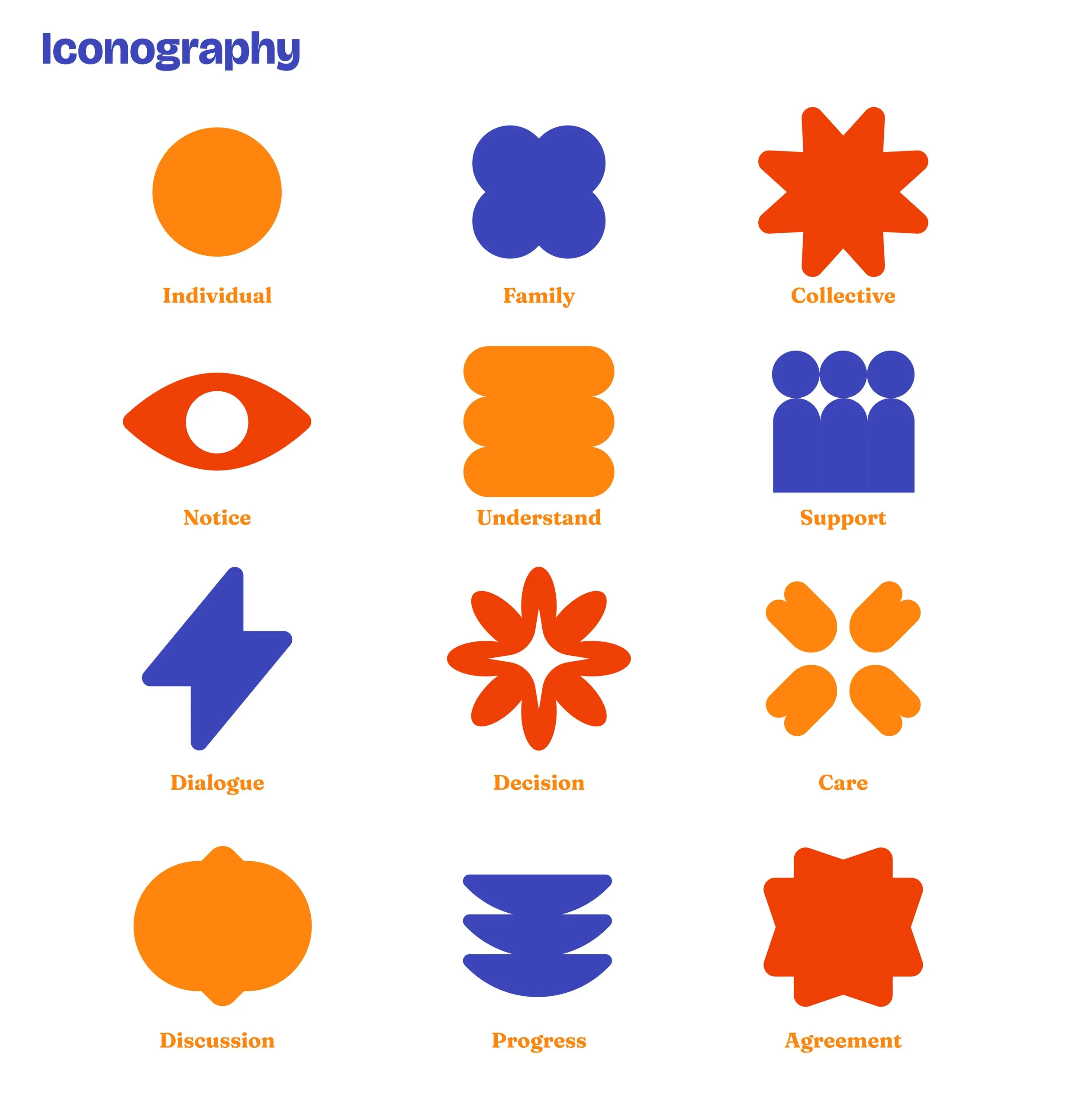
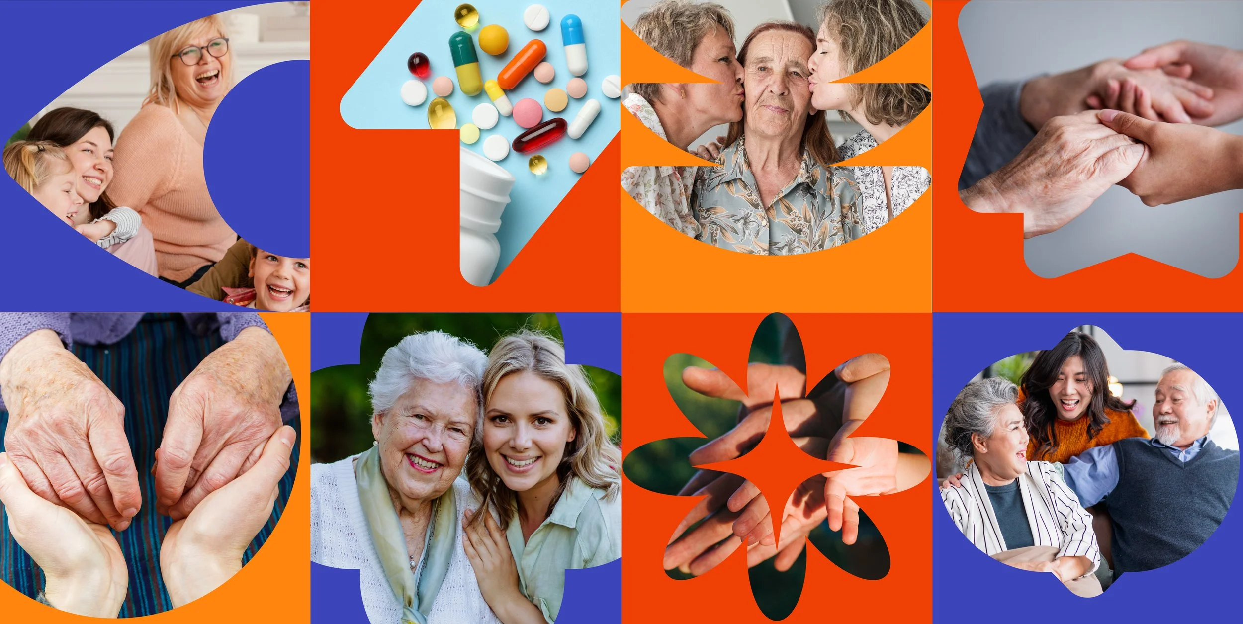
At the heart of the colour palette is Turmeric Yellow, chosen for its associations with healing, care, family connection and comfort. Deeply rooted in many cultures as both a medicinal and communal ingredient, it acts as a visual anchor for the brand. Supporting colours were introduced to represent different emotional states within the caregiving journey, creating a system that balances warmth with clarity and action.


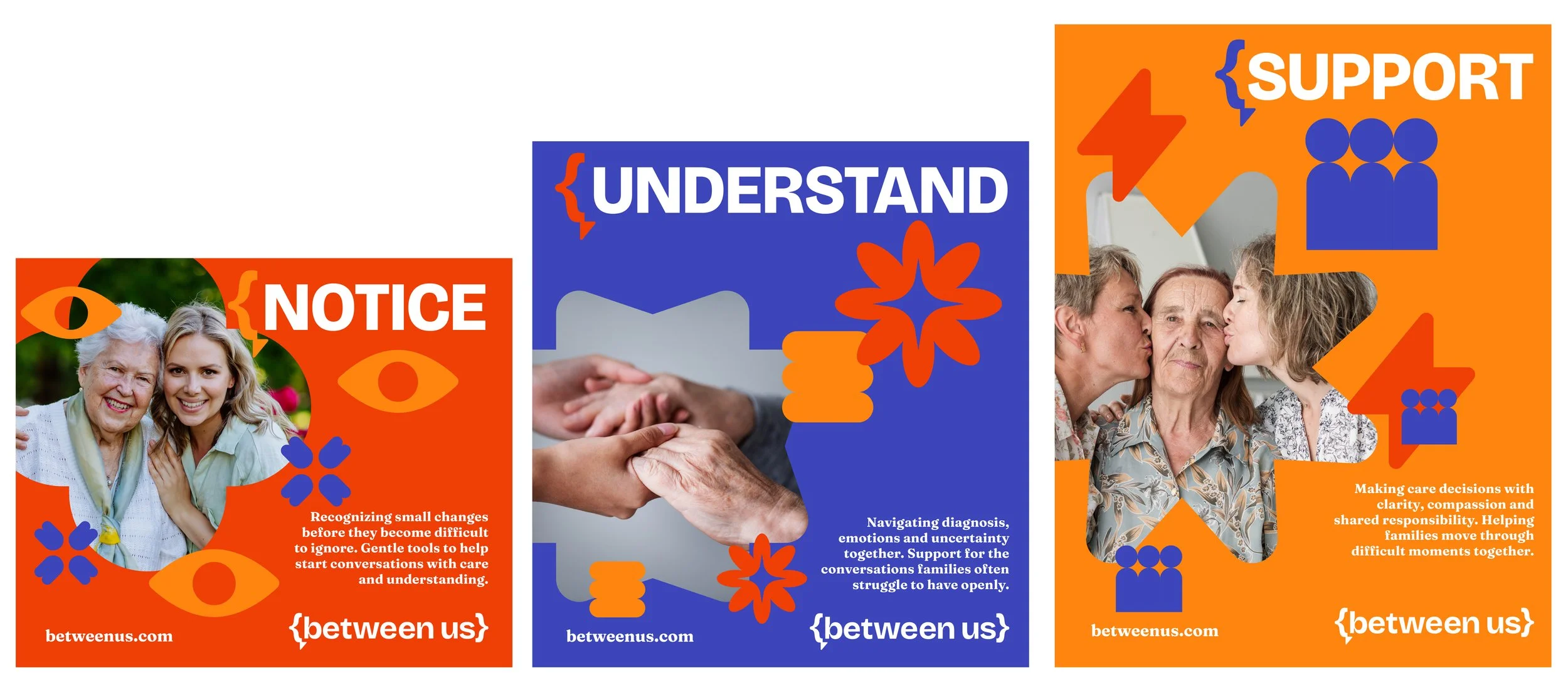

A system of abstract geometric shapes was developed to represent caregiving dynamics such as care, support, dialogue, decision-making, family relationships and collective responsibility. These forms are layered with colour to create adaptable visual compositions across print, digital and interface applications, reinforcing the idea that caregiving is a shared and evolving experience.
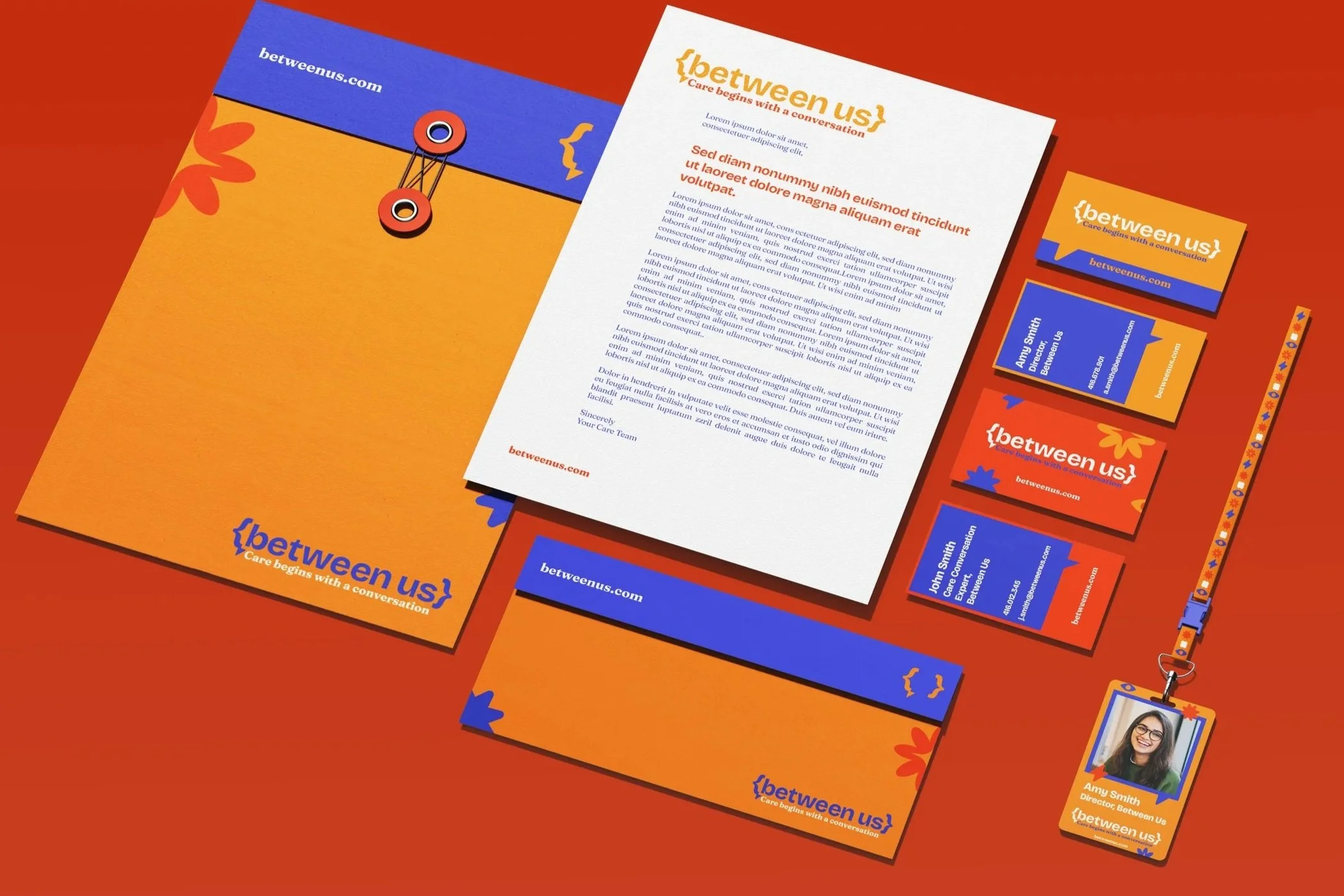
The identity system was designed to scale across multiple touchpoints, creating a cohesive experience regardless of platform or context. The brand was extended across website and app interfaces, conversation cards, guided workbooks, worksheets, stationery, conference and event branding, social media assets and merchandise, ensuring a consistent visual language across both digital and physical experiences.

IMPACT:
Between Us identifies an emerging gap between healthcare systems that provide information and families who are left to navigate the emotional realities of care on their own.
The project proposes a communication-first approach, positioning design as a tool for supporting intergenerational dialogue, shared decision-making and emotional preparedness within caregiving contexts.
Rather than focusing on healthcare delivery, the system reframes the challenge as one of language, connection and emotional structure during moments of uncertainty.
This project allowed me to explore the intersection of brand design, service design and behavioural communication. It demonstrates how visual identity, language systems and digital tools can work together to support emotionally complex experiences and create meaningful impact beyond traditional healthcare environments.

CREDITS:
Concept, Brand Design and Visual System: Wajeeha Abbasi
Project Type: Self-initiated brand and service design project
Focus Areas: Brand Identity, Service Design, UX Design, Interaction Design, Editorial Systems,
Behavioural Communication, Communication DesignCopyrights: All Rights Reserved - Wajeeha Abbasi